Introduction
With over 270,000 continuous integration (CI) jobs running to test products like RHEL, OpenStack, and OpenShift, our Distributed CI (DCI) system has accumulated vast amounts of data. Although this information was accessible through our API, it remained largely underutilized. A few years ago, we decided to tap into these data by offering users specialized analytical views, each page presenting insights on a particular aspect of our CI jobs. For example, users could view statistics on job statuses broken down by product version.
Early adopters were thrilled by these new data insights. However, after the novelty wore off, usage dropped. Why? Because each user needed personalized queries. Our goal became clear: provide greater flexibility for data exploration and support a variety of chart types for richer visualization.
Needs and Challenges
DCI Analytics serves several user groups:
- Product managers at Red Hat and among our partners, who track the quality and progress of their products.
- Technical teams, including developers and quality engineers, who need to pinpoint pipeline issues and detect anomalies or regressions introduced by recent changes.
For decision-makers, the objective is straightforward: monitor product health and trends. For developers and QA engineers, the focus is on quickly identifying CI pipeline failures and performance shifts.
The Old Approach: Fixed Visualizations
Our initial analytics views offered only rudimentary filtering and generic use cases. A project manager wanted high-level overviews, while a QA engineer needed to drill down into a very specific subset of jobs. Static views simply couldn’t satisfy both.
Despite its limitations, this phase was invaluable. It helped us map out the scope of views users actually needed and revealed that each view tapped into only a subset of DCI jobs.
What if we separated query filtering from visual rendering? And what if selecting job subsets could be made truly generic?
Evolution: Introducing a DSL for Customizable Views
A domain-specific language (DSL) is tailored to the needs of a particular application domain, offering powerful abstractions and concise notation. We created a simple, business-friendly language that compiles into database queries behind the scenes.
For instance, to find all jobs where the component name equals OpenShift 4.18.6, a user can type:
(components.name = 'OpenShift 4.18.6')
instead of writing complex SQL for example:
SELECT j.*
FROM jobs j
JOIN jobs_components jc ON j.id = jc.job_id
JOIN components c ON jc.component_id = c.id
WHERE c.name = 'OpenShift 4.18.6';
Better, right?
Documentation and User Guidance
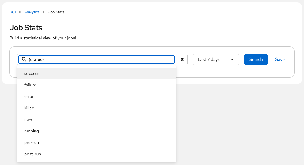
Even simple DSLs require onboarding. To make our DSL intuitive, we enhanced the search bar with real-time autocomplete. As users type, we suggest available operators and values:

This live assistance makes it easy to discover available fields. We extended autocomplete to all API data, making searches even smoother.
Data Infrastructure: Eventual Consistency
Our CI data lives in PostgreSQL database, a relational database optimized for complex queries, heavy joins, and transactional integrity. However, for high-volume reads, a document store is faster. From day one, DCI Analytics has maintained a second data store in Elasticsearch alongside PostgreSQL.
Using a CQRS (Command Query Responsibility Segregation) pattern, we keep Elasticsearch in sync via periodic updates from the primary database. This “eventual consistency” ensures both stores converge over time. Even if Elasticsearch is temporarily unavailable, our service continues to operate using PostgreSQL. Initial synchronization took just a few weeks, delivering our first dynamic views rapidly.
We’re planning to evolve this setup by adopting an event bus, pushing updates to Elasticsearch in real time whenever a job is created or modified—enabling near-instant data freshness.
Real-World Use Cases
What insights can you gain with DCI Analytics? Below are some of our dynamic views:
Job Stats: Build Instantaneous Status Dashboards
The Job Stats view generates pie and bar charts showing the success and failure rates of CI jobs. For example, using the DSL query:
(product.name = 'OpenShift')
you might see:

To compare across teams:
(product.name = 'OpenShift') and ((team.name = 'Team 1') or (team.name = 'Team 2'))
Then simply group by team name:

Additional grouping keys like component name, remoteci name are also available.
Key Values: Visualize Custom Metrics
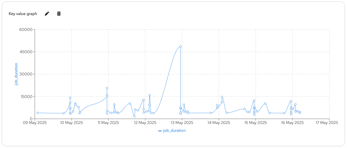
Key values allow you to attach numeric metrics to each CI job. You can then chart trends over time. For example in DCI pipelines we added job duration to our job:

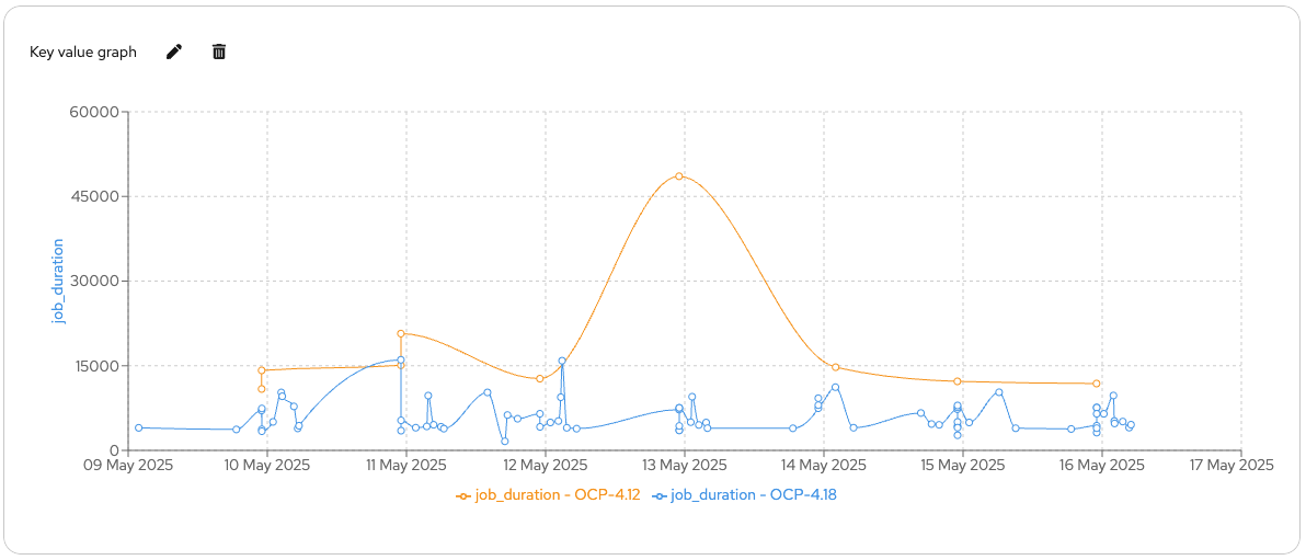
If you spot an anomaly, group by another field (e.g., topic) to isolate the cause. Here OCP-4.12 was the issue:

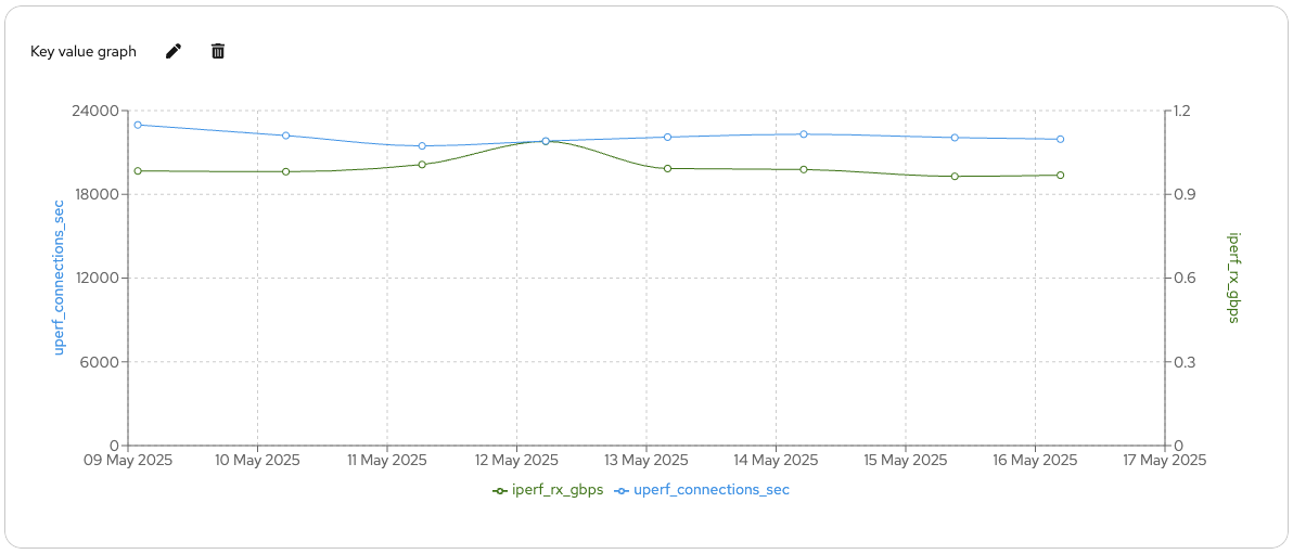
For comparing metrics with different scales, spread the axes:

Component Coverage: Track Tested Components at a Glance
With thousands of daily changes across platforms like OpenShift and RHEL, tracking which components are exercised by your CI matrix is critical. The Component Coverage view lists components alongside associated jobs and their outcomes, giving you immediate visibility into test coverage for any product version.
Conclusion
DCI Analytics unlocks the full potential of your CI data by combining a user-friendly DSL with powerful, dynamic visualizations. Instead of wrestling with SQL or static dashboards, you can craft precise queries in plain language, visualize trends instantly, and drill down to root causes in seconds. Our dual-store architecture delivers the speed of Elasticsearch and the reliability of PostgreSQL, while autocomplete guidance ensures you’ll be productive from day one.
Take control of your continuous integration insights—streamline decision‑making, detect issues early, and continuously improve your pipelines. Try DCI Analytics today, and transform how you analyze CI, and let DCI Analytics drive your next release to success!
